
An audience can’t listen to your presentation and read detailed, text-heavy slides at the same time (not without missing key parts of your message, anyway). So make sure your slides pass what I call the glance test: People should be able to comprehend each one in about three seconds.
Think of your slides as billboards. When people drive, they only briefly take their eyes off their main focus — the road — to process billboard information. Similarly, your audience should focus intently on what you’re saying, looking only briefly at your slides when you display them.
Keep It Simple
Research shows that people learn more effectively from multimedia messages when they’re stripped of extraneous words, graphics, animation, and sounds. Lots of extras actually take away meaning because they become a distraction. They overtax the audience’s cognitive resources.
So when adding elements to your slides, have a good reason: Does the audience need to see your logo on each slide to remember who you work for? Does that blue swoosh add meaning? If not, leave it off. The same goes for text. Keep it short and easy to skim. Scale the type as large as possible so the people in the back of the room can see it.
It’s also important to stick to a consistent visual style in your slide deck. Select one typeface — two at most. Use the same color palette throughout (limit yourself to three complementary colors, plus a couple of neutral shades, like gray and pale blue). Photos should be taken by the same photographer or look as if they are. Illustrations should be done in the same style.
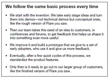
Consider the “before” slide below. It fails the glance test because it’s packed with text. It’s functioning like a teleprompter — which may help you remember what to cover but won’t make it easier for the audience to digest it.
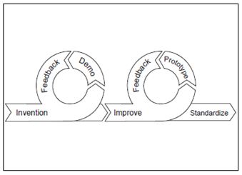
Instead, streamline the text and incorporate simple visual elements (and save teleprompter text for the “notes” field, which the audience can’t see). You’ll reinforce your message and make it easier for people to get what you’re saying. Here’s an “after” slide to illustrate:
Arrange Slide Elements with
Care
Another way to help people process your visuals more quickly: Think like a designer when you arrange slide elements.
These five design principles will help you simplify your slides so they’ll pass the glance test:
Flow. You can direct people’s eyes to certain areas of a slide to emphasize important points. Here, for example, your eye takes in the cluster of grapes, then moves to the message about quality, and then focuses on one beautiful grape from the “yield”:

Contrast. Our eyes are drawn to things that stand out, so designers use contrast to focus attention. Create contrast through your elements’ size, shape, color, and proximity. In this example, a presenter compared cross-sections of skin and soil to show that tending to both requires an understanding of the microbiological activity beneath the surface. The blurred backgrounds set off the stark white illustrations for quick visual processing:

White space. White space is the open space surrounding items of interest. Presenters are often tempted to fill it up with additional content that competes for attention. But including a healthy amount of white space sharpens viewers’ focus by isolating elements. In this example, if we’d paired the text with a larger or more detailed image, your eye wouldn’t know where to begin, and the quote would have lost its power:
Hierarchy. A clear visual hierarchy allows viewers to quickly ascertain a slide’s most important elements:

Unity. Slides with visual unity look as though the same person created them and make your message feel cohesive. You can achieve this through consistent type styles, color, image treatment, and element placement throughout the slide deck. Here’s a pair of slides to illustrate:

Presentation software gives us many shiny, seductive elements to work with. But there’s beauty and clarity in restraint. Use simple visuals that support your message, and you’ll free people up to really hear — and adopt — your ideas.
Source of this article;
https://hbr.org/2012/10/do-your-slides-pass-the-glance-test/